FastMetrics, Part 5 - Aggregation and Analysis
Aggregating and analyzing the real user metrics collected from the field.
Background
At last, the day of reckoning draws nigh - all of the data has been collected, and we are ready to begin the analysis! Unlike working with raw data points, there are a few subtleties to handling pre-aggregated data, such as the ones created by our FlatHistogram and ExponentialHistogram implementations, but as my friend’s Russian physics professor likes to say, “is simple; is not hard.”

After I gave my Monitorama talk on client side performance instrumentation, this was the article that I intended to write. What I didn’t realize at the time was that there was a lot of plumbing required in order to have the necessary data available to be able to write this article! We now have the necessary tools to ensure that:
- We know how to pre-aggregate and send the data even on the most low end clients,
- We can see clean distributions (we don’t need to average or sample),
- Rare events (that are pretty frequent) won’t slip through our fingers,
- We can drop the zero counts that don’t help us,
- We know how to make use of the nearly infinite free compute power at the edge,
so now we’re ready to:
- See those distributions,
- Calculate IECDFs and know our 99th, 99.5th, or median percentiles,
- See the effects of network instability
- Teleport ourselves to feel what our customer’s feel,
- Join work discussions knowing that Data > Opinions.
Let’s go analyze some RUM metrics and see how our application is performing in the field!
Today’s Agenda
Today we will cover everything needed to recreate the charts shown in my talks, as well as firm up our understanding of how to use R to extract some useful insights from the raw logs. If I’m wildly successful, I’ll even manage to get Firefly Season 2 made, but let’s not get too far ahead of ourselves quite yet.
The agenda is:
- Pull the logged data out of kafka, assigning ASNs to each record,
- Calculate a summary histogram on network properties per ASN,
- Discuss and calculate the network instability,
- Create clusters of similar ASNs based on k-means,
- Review how to plot it and develop some intuitions on it,
- And, of course, talk Netflix into making the season and loading the necessary boxart:

Step 6 seems to be taking a lot longer than I originally expected, so I put it on the back of my business card to remind myself to work harder:

I get about one chance per year to talk to Ted, and now you won’t need to guess what we talk about.
The Pieces
I. Working with a previously aggregated histogram in R If you don’t have a copy of R, it’s free, and you might want to pick that up before continuing. It’s fine to do the actual data analysis in the cloud, but working with R on your local machine is generally much easier, and the plots are all done locally. Also, load up the HistogramTools, Cluster, and RColorBrewer packages, which is done differently on different platforms; on the Mac / Quartz build, it’s under the “Packages & Data” menu, “Package Installer”, “Get List”, type in HistogramTools in the “Package Search Blank”, select the package in the list, then choose “Install Selected”. On Linux, after having built R from source (covered below), it can be installed right at the R interpreter by typing:
our_packages <- c('HistogramTools','cluster','RColorBrewer')
install.packages(our_packages, dependencies=TRUE)
Next, let’s load the library and plot a trivial histogram of the die rolls from Part 2, which was:
{
 "name":"dierolls",
 "layout":"F/0/200/10",
 "data":{
  "20":0,"40":1,"60":3,"80":0,
  "100":0,"120":0,"140":0,
  "160":0,"180":0,"200":0
 }
}
No worries if you don’t have a die with hundred sides, they’re easy to source online, or you can always roll a 5d20 in a pinch, just don’t anger the demogorgon.

R uses a slightly different format for histograms from what we captured there, where you more precisely specify both edges of the bin as the “breaks” instead of just the highest value of that bin, which we can workaround in the above example by observing that the first break is 0 from the layout field. We could complicate this by assuming the values were likely in the center of each bin, but the reduction in quantile error isn’t worth the complexity for this case.
From this JSON bundle, we separate the breaks (adding zero) from the counts in those bins into two separate R vectors, after we load the HistogramTools library:
library(HistogramTools)
rollbreaks <- c(0, 20, 40, 60, 80, 100, 120, 140, 160, 180, 200)
rollcounts <- c(0, 1, 3, 0, 0, 0, 0, 0, 0, 0)
rollhistogram <- PreBinnedHistogram(rollbreaks, rollcounts, 'dierolls')
and then we can confirm that this looks right by zooming in on the graph between 0 and 80:
plot(rollhistogram, xlim=c(0,80), col=c('skyblue'))
which should look like this:
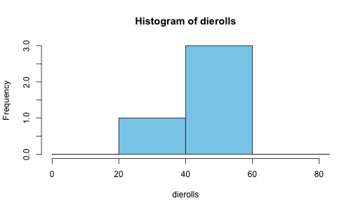
The PreBinnedHistogram utility will do the heavy lifting of converting our already grouped data into the internal histogram representation most commonly used by R, so we now have access to all of the analytical tools normally available to histograms in R.
II. Mapping to ASNs Since we’re going to be consuming the data in python below, we’ll need a small function to handle mapping the IP addresses to ASNs based on our sqlite3 iptoasn.db table ipasnmap that we built last time. Here’s a hastily written python module to do so:
# on terminal 4 of the server from part 1:
cat > iptoasn.py <<EOF
import sqlite3, socket, struct

conn = sqlite3.connect("iptoasn.db")

def iptoasn(ipDottedQuad):
    global conn
    ip = struct.unpack("!L", socket.inet_aton(ipDottedQuad))[0]
    c = conn.cursor()
    c.execute("""SELECT asn FROM ipasnmap
        WHERE ? >= netblock AND ? <= lastipinblock
        ORDER BY cidrprefix DESC,ts DESC
        LIMIT 1""", (ip, ip))
    return c.fetchone()[0]
EOF
I’ve hardcoded the connection which should serve our simple batch use case, and used the same query from Part 4. For more serious performance, there are better in-memory representations of the IPv4 / ASN mapping space (these days, with a few gigs of RAM, we could even unroll the entire IPv4 address space for true O(1) lookups), however sqlite3 provides us with an easy and fast enough interface, and it still runs on our $10 Raspberry Pi Zero W.
III. Getting data from Kafka Getting data out of Kafka turns out to be a piece of cake; figuring out which data to drain for each consumer and keeping the consumers coordinated is significantly harder, and a topic for another day. As we’re only interested in analyzing the logged data on this one topic from a single consumer for all events since the beginning of (Kafka’s) time, we can avoid all of the complexities involved here.
It is worth noting that in a true production system, it would be easier to stage the data in some sort of queryable big data repository based on a reasonable time partition, such as hourly, rather than reprocessing everything every time, or having the analysis clients keep track of where they are in the feed. For Netflix, I wrote a UDAF to create the summary histograms, but that’s a topic all on its own, so we’ll just parse and summarize it standalone for now.
Let’s pull the records out and repack them in PreBinnedHistograms for R. We could also do this analysis directly in python, or have R do the ETL, but this seems simpler to describe. Also, I will assume the data already has the zeros in the set, but we could also add a function to add the zeros back in at this time.
This part extracts each message from Kafka and calls process_message on the non-empty ones:
from kafka import SimpleConsumer, KafkaClient
def consume_topic():
    k = KafkaClient("localhost:9092")
    c = SimpleConsumer(k, "consumepy1", "test", auto_commit=True)
    c.seek(0, 0)

    for _ in range(10):
        message = c.get_message(block=True)
        if message != None:
            process_message(message.message.value)
    k.close()
After connecting to Kafka, we’re manually seeking to the first message in the topic (what Kafka calls “the beginning of time”), taking up to 10 messages, and calling process_message on them. In process_message, we’ll parse the json, check for a few necessary fields, resolve the ASN, and convert the data to the R PreBinnedHistogram format:
import json
from iptoasn import iptoasn

def process_message(raw_message):
    message = json.loads(raw_message.decode("utf-8"))
    if message == None or "d" not in message:
        print("invalid message")
        return
    asn = str(iptoasn(message["sip"]))
    if asn == "NaN":
        return
    full_histogram = None
    if message["d"]["layout"].startswith("F/"):
        full_histogram = json.dumps(message["d"]["data"])
        histogram_name = message["d"]["name"]
        print( "\t".join([histogram_name, asn, full_histogram]))
This builds a tab separated set of records for the batch that we can run independently (even against different parts of the Kafka topic, in parallel). Be careful of ASNs that resolve to NaN’s in our data - on a busy site, this is one way to see what kind of coverage our iptoasn function has.
Next, let’s aggregate these results by each histogram_name / ASN combination, producing a single summary histogram of that metric, and transform that to a format that R can understand. To simplify, let’s filter out everything except the dnsTimeF metric:
import json

def aggregate_intermediate(filename):
    agg = {}    # aggregated histograms by name / asn
    ifile = open(filename, "r")
    for line in ifile:
        parts = line.split("\n")[0].split("\t")
        (metric_name, asn, raw_histogram) = (parts[0], parts[1], parts[2])

        # remove this to process all metrics
        if metric_name != "dnsTimeF":
            continue

        # add the name / asn if they're not there
        if metric_name not in agg:
            agg[metric_name] = dict()
        if asn not in agg[metric_name]:
            agg[metric_name][asn] = dict()

        # merge the new histogram to the summary
        aggregate_histogram = agg[metric_name][asn]
        merge_to_aggregate_histogram(
                aggregate_histogram, raw_histogram)
    ifile.close()
    output_summary_histograms(agg)
Ignoring the tedious and hastily written code, we read in the intermediate file from the batch processing and build a large dictionary in agg to find entries that come from the same name & ASN pair, and add them together. Lastly, we unwind agg and convert the dictionaries the way R expects:
def get_r_histogram(name, histogram):
    h = sorted({int(k):v for k,v in histogram.items()}.items())
    breaks = "0," + ",".join(map(lambda x: str(x[0]), h))
    counts = ",".join(map(lambda x: str(x[1]), h))
    return "PreBinnedHistogram(c(%s), c(%s), '%s')" % (
            breaks, counts, name)

def output_summary_histograms(aggregation):
    for name, asnbundle in aggregation.items():
        for asn, summary_histogram in asnbundle.items():
            print("\t".join([
                    asn,
                    str(summary_histogram["asncount"]),
                    get_r_histogram(name, summary_histogram)
                ]))
We could turn this into a proper map-reduce problem and not process everything using an in memory dictionary, but for smaller record sizes (hundreds of thousands), this should work fine. Save the output (I redirected it) to aggregate.tsv.
IV. Instability Before doing any sort of analysis, I find it always helps to take a look at the data first and develop some intuition, and to make sure we didn’t make any critical errors. Our aggregator gives us an R formatted summary histogram for one ASN, for a short time period:
PreBinnedHistogram(c(0,6,12,18,24,30,36,42,48,54,60,66,72,
  78,84,90,96,102,108,114,120,126,132,138,144,150,156,162,
  168,174,180,186,200), c(35,1,23,25,3,1,5,8,11,2,0,2,0,
  0,0,6,4,0,1,0,0,0,1,0,0,0,0,0,1,1,0,6), 'duration')
There aren’t that many samples in there, but we can assign it to a variable and plot it easily:
oneasn <- PreBinnedHistogram(c(0,6,12,18,24,30,36,42,48,
  54,60,66,72,78,84,90,96,102,108,114,120,126,132,138,
  144,150,156,162,168,174,180,186,200), c(35,1,23,25,3,
  1,5,8,11,2,0,2,0,0,0,6,4,0,1,0,0,0,1,0,0,0,0,0,1,1,
  0,6), 'duration')
plot(oneasn, col=c('skyblue'))
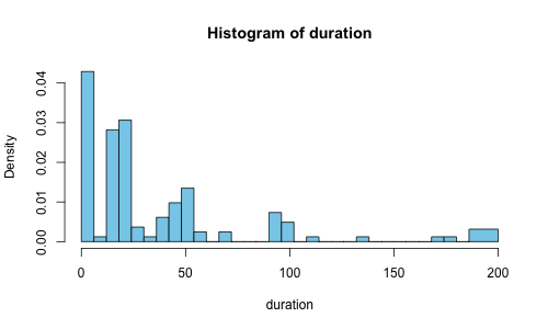
We’re seeing a tip to the left, with a few outliers sneaking in on the far right tail. So where’s the median (50th percentile)? Where’s the 95th percentile? How do we even answer these questions?
Rather than trying to guess this visually, let’s do a little math. The Cumulative Distribution Function (CDF) for these bins (which represent milliseconds that a request takes to complete) can tell us at a given duration, what percentile of requests completed in that time. The version of this based on real empirical data is called, unsurprisingly, the Empirical Cumulative Distribution Function (ECDF). Fortunately, HistToEcdf from HistogramTools makes it easy to compute the ECDF from a histogram:
plot(HistToEcdf(oneasn, method='linear'))
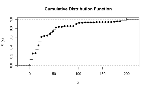
But we really want the inverse of that - we would like to know at a given percentile (say the median), how long did each request take? The inverse of this is known as the Inverse Empirical Cumulative Distribution Function (IECDF); let’s make a new function called the iecdf_one_asn that captures it, and then we can plug in the 50th and 95th percentiles and see what the values are:
> iecdf_one_asn <- HistToEcdf(
  oneasn, method='linear', inverse=TRUE)
> iecdf_one_asn(.50)
[1] 20.16
> iecdf_one_asn(.95)
[1] 175.2
There we go, our 50th was at 20ms, and our 95th was at 175ms. On that scale, those two are very far apart. On a perfectly stable network and with a perfectly stable server (and a perfectly oriented moon casting a sheen on perfectly normal flying pigs), all requests would take exactly the same amount of time, which is to say the 50th percentile == 95th percentile == 20ms, in this case. Despite recent advances in Porcine Aviation, the 95th is usually not that close to the 50th, even over large sample sizes.

We define the instability of the network as the ratio of the 95th percentile / 50th percentile; in the stable case (20ms / 20ms) this is 1, but in the above case (175ms / 20ms) that we just measured, this is about 9.
Granted, this isn’t very surprising when all of the test data comes from a single web browser talking to a single server. Most of the left side values are a result of various kinds of caching behavior. The best thing to do, if possible, would be to separate the data out at the source, but we can also approximate this by eliminating any improbably small network values. I know in this case, the ping time is 65ms between the browser and the server, so I can cleanly eliminate all numbers below that (and a bit above, though it starts to quickly get messy).
Without getting fancy, we can see that the 12th entry is for 66ms. Let’s construct a subset of the histogram from the range of the 12th break to the full length, and look at its median and 95th:
> oneasnsubset <- PreBinnedHistogram(
  oneasn$breaks[12:length(oneasn$breaks)],
  oneasn$counts[12:length(oneasn$counts)],
  oneasn$xname)
> iecdf_one_asn_subset <- HistToEcdf(
  oneasnsubset, method='linear', inverse=TRUE)
> iecdf_one_asn_subset(0.5)
[1] 100.5
> iecdf_one_asn_subset(0.95)
[1] 197.4333
This has an instability of about 2, closer to what I observed earlier on this network at that time. If we collected more samples, we’d notice patterns which reflects the various CDNs that we’re collecting requests from and the different asset sizes.
V. Clustering and k-means Finally, the pure data domain! Time to go exercise our analytics skills!
Make sure that after you load R, you have the aggregate.tsv file in the current working directory - you can check that with getwd() and change the directory with setwd(PATH).
If you don’t have any aggregate data, don’t worry, I’ve got you covered. I asked some friends on different ASNs to click a page that already had the logging and PerformanceTiming metrics from the browser all wired up. After processing it the way I showed above, the data is available here. I switched over to the durationF metric as most of the DNS data that I was looking at was showing cache hits, and we’d need a much larger sample to see the network effects.
From here, I’ll assume that you’re in a fresh R session and that nothing else has been loaded yet. First, we need to load the libraries we’ll need and load up the data to a data frame:
library('HistogramTools')
library('RColorBrewer')
library('cluster')

rawhisttable <- read.table(
  file = as.character("aggregate.tsv"),
  sep = '\t', quote="^",
  col.names = c('asn', 'asncount', 'hist'))
The read.table just loads the data from the tab separated file into the rawhisttable variable and names the columns. I use the quote parameter to prevent R from removing the quotes from the metric_name field in the hist column - you can set it to anything that doesn’t occur in the file, I just used the caret (“^”).
Since this is a pretty thin data sample (feel free to click the link yourself if you want better ASN coverage), let’s filter out any ASNs where we didn’t get at least 3 counts:
histtableatleast3 <- subset(rawhisttable, asncount >= 3)
We already know how to process one histogram at a time and compute the IECDF from the last section, but can we do it with an entire column of histograms in a data frame? Sure! But we’ll also need to convert the textual “PreBinnedHistogram” fields into their actual R equivalents by parsing and evaluating them. To do so, let’s make functions that do that work and return the IECDF at a given percentile:
GetPercentile <- function (aHistogramString, percentile) {
    a <- eval(parse(text=as.character(aHistogramString)))
    iecdf <- HistToEcdf(a, method='linear', inverse=TRUE)
    iecdf(percentile)
}

GetP50 <- function(x) GetPercentile(x, 0.5)
GetP95 <- function(x) GetPercentile(x, 0.95)
Most of that function is just busy work to coerce a string form of a histogram into an actual PreBinnedHistogram, then calculate the inverse ECDF and return the value at a given percentile. GetP50 and GetP95 are two helper functions that bind the median and 95th percentile to their own functions so that we don’t need to worry about R’s function currying / partial application syntax. We now have the tools to rebuild our data frame with the 50th and 95th percentiles:
quantileP50 <- lapply(histtableatleast3$hist, GetP50)
quantileP95 <- lapply(histtableatleast3$hist, GetP95)

quantileDataFrame <- data.frame(
  asn=histtableatleast3$asn,
  asncount=histtableatleast2$asncount,
  p50=as.numeric(quantileP50),
  p95=as.numeric(quantileP95)
)
The lapply is just applying the GetPercentile (GetP50 and GetP95 variants, specifically) function to the list of histograms in the table. We copy the asn and asncount columns across so that we have them handy for our plots.
One way of clustering these ASNs is by using the k-means algorithm. To do so, we need another data frame with just the p50 and p95 columns in them:
justp50p95 <- data.frame(
  p50=quantileDataFrame$p50,
  p95=quantileDataFrame$p95)
fit <- kmeans(justp50p95, 3)
k-means used to be quite a pain to calculate, but it’s just a line in R. We now have a variable (called fit) that contains a clustering vector that we will use to group our ASNs based on their p50 to p95 relations, representing the instability of the observed metrics in those ASNs.
VI. Plotting
Before we can plot, we’re going to need a few colors to see which ASNs share similar instability characteristics. To do so, I chose the Dark2 palette from RColorBrewer, and added an alpha channel to support blending using a function called add.alpha picked up from the web:
add.alpha <- function(col, alpha=1){
  if(missing(col))
    stop("Please provide a vector of colours.")
  apply(sapply(col, col2rgb)/255, 2,
                     function(x)
                       rgb(x[1], x[2], x[3], alpha=alpha))
}

plotcolors <- brewer.pal(n=8, name="Dark2")
plotcolors <- add.alpha(plotcolors, alpha=0.5)
Great! With our plot colors ready to go, let’s take a look at this thing:
plot(quantileDataFrame$p50, quantileDataFrame$p95,
         main="Sample Instability by ASN",
         xlab="50th Percentile", ylab="95th Percentile",
         cex=quantileDataFrame$asncount / max(quantileDataFrame$asncount) * 20.0,
         col=plotcolors[fit$cluster], pch=16, cex.lab=1.4)
grid()
Which should give us something that looks like this:
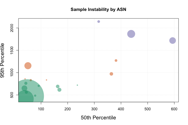
The cex field is being used to scale the bubbles to the count of data points that we have in that ASN to give us a quick sense of how big our data set for that ASN is. The col field will color the points based on the result of the k-means clustering vector, and the pch field selects circles for plot shapes (plot type 16). The other fields handle the more mundane aspects of plotting, namely labeling the axes, the chart, sizing the text, and indicating where to get the data series from. Feel free to experiment with different values!
The purple and some of the orange circles look like interesting optimization candidates. From a purely network perspective, it would be very interesting to see what the application looks like to them, and challenge ourselves to build an app that works equally well across all of these cohorts. The green circles show our comfort zone, and we now have a good idea of how long it takes for our requests to complete to our clients.
Now that we can break out our user population by similar network characteristics, we can:
- Select which users could receive different treatments,
- Gain architectural insight into the operating environment of our current users (without guessing), and
- Allow us to validate our lab simulations and synthetic tests.
Even better, now we know how to capture fast moving events at any resolution we desire, such as key/touch/click-to-render (responsiveness), decode times, or even oscillating effects such as devices switching networks.
Conclusion
We made it! Fast metrics allow us to see full distributions, without averages nor sampling, and we have all the tools to easily measure without guessing. The example data set shows us that we’re loading all of our network assets reasonably quickly, so we can confirm that the cloud hosting, CDN, and DNS providers used are giving us great global coverage.
That leaves us with all the time we need to work on the real problem that remains - how are we going to get Joss to make Firefly Season 2? If you have any ideas, please let me know ASAP on Twitter. Until next time, be excellent to each other, and data on!